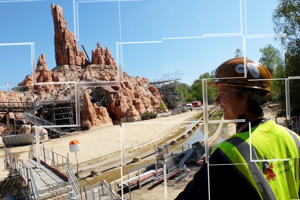
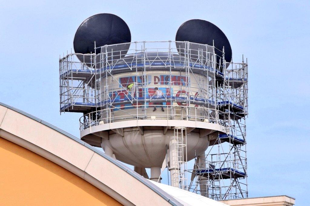
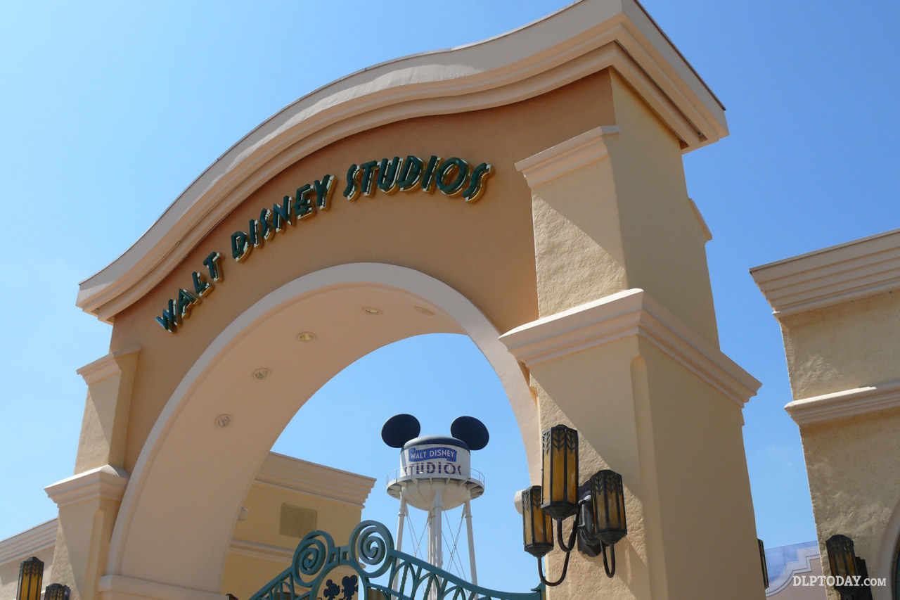
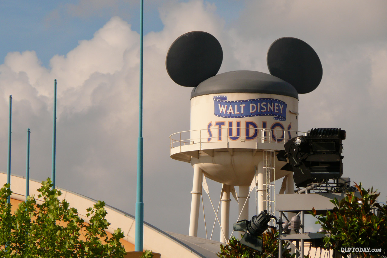
The Earffel Tower, icon of Walt Disney Studios Park, will soon have a brand new face. As part of a general (and as we seem to always say, much-needed) refurbishment of the water tower in the Front Lot entrance of the park, the opportunity is also being taken to replace the original 2002 “filmstrip” logo with a new-look design.
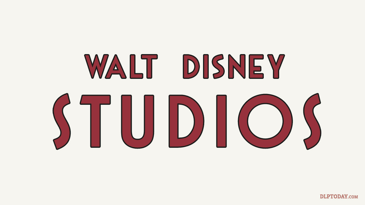
Based on current progress, the “new” logo appears to have more classic, maroon red-coloured lettering with a simple black outline on a plain background. Without doubt the look has the potential to be much more 1930s in style, boding well for any future changes to the entrance of the park, which lacks any definable time period setting.
In terms of its actual typeface and size, the logo is similar if not identical to before, with only the “Walt Disney” letters flattened out from their wavy design following the filmstrip in the original, which used a modern palette of blue, yellow and red. The typeface, similar to ITC Anna, remains the same as seen around the area, including lettering on Disney Studio 1.

A very rough current approximation of the new logo (typeface not fully accurate)
For Walt Disney Studios Park, it’s a wise and very welcome decision to come up with a logo design unique to the very prominent Earffel Tower.
The 2002 logo was created primarily for the promotion of the park in brochures and park guides, not to provide any kind of thematic detail within the park itself. Until now, adorned with just the standard modern park logo, the famous water tower hasn’t actually felt part of a specific period or place you’re being transported to. After all, you don’t see the garish pink Disneyland Park marketing logo on the entrance to that park.
Over in Florida, the Earful Tower remains somewhat hidden away at the back of the park, so less important thematically, though it too had a recent rebranding with the name change from Disney-MGM Studios to Disney’s Hollywood Studios.
Elsewhere in the Paris park, a similar maroon colour was used to great effect on the Walt Disney Television Studios building, replacing its cold original turquoise colours.